ShopDreamUp AI ArtDreamUp
Deviation Actions


![Meeting the Princess of Friendship [Speedpaint]](https://images-wixmp-ed30a86b8c4ca887773594c2.wixmp.com/f/4a0d8d50-53aa-4f0a-8101-fafadc772d07/ddr9ni1-4c87acb2-337a-407c-a613-41f99a21801e.png/v1/crop/w_184,h_184,x_17,y_0,scl_0.26285714285714,q_70,strp/meeting_the_princess_of_friendship__speedpaint__by_lavenderrain24_ddr9ni1-92s-2x.jpg?token=eyJ0eXAiOiJKV1QiLCJhbGciOiJIUzI1NiJ9.eyJzdWIiOiJ1cm46YXBwOjdlMGQxODg5ODIyNjQzNzNhNWYwZDQxNWVhMGQyNmUwIiwiaXNzIjoidXJuOmFwcDo3ZTBkMTg4OTgyMjY0MzczYTVmMGQ0MTVlYTBkMjZlMCIsIm9iaiI6W1t7ImhlaWdodCI6Ijw9NzAwIiwicGF0aCI6IlwvZlwvNGEwZDhkNTAtNTNhYS00ZjBhLTgxMDEtZmFmYWRjNzcyZDA3XC9kZHI5bmkxLTRjODdhY2IyLTMzN2EtNDA3Yy1hNjEzLTQxZjk5YTIxODAxZS5wbmciLCJ3aWR0aCI6Ijw9OTYwIn1dXSwiYXVkIjpbInVybjpzZXJ2aWNlOmltYWdlLm9wZXJhdGlvbnMiXX0.-JWWK1vOBHVjV2yu5T-3tBR-zAJ4SYZ2b_SFyXBT14c)
![Meeting the Princess of Friendship [Speedpaint]](https://images-wixmp-ed30a86b8c4ca887773594c2.wixmp.com/f/4a0d8d50-53aa-4f0a-8101-fafadc772d07/ddr9ni1-4c87acb2-337a-407c-a613-41f99a21801e.png/v1/crop/w_92,h_92,x_9,y_0,scl_0.13142857142857,q_70,strp/meeting_the_princess_of_friendship__speedpaint__by_lavenderrain24_ddr9ni1-92s.jpg?token=eyJ0eXAiOiJKV1QiLCJhbGciOiJIUzI1NiJ9.eyJzdWIiOiJ1cm46YXBwOjdlMGQxODg5ODIyNjQzNzNhNWYwZDQxNWVhMGQyNmUwIiwiaXNzIjoidXJuOmFwcDo3ZTBkMTg4OTgyMjY0MzczYTVmMGQ0MTVlYTBkMjZlMCIsIm9iaiI6W1t7ImhlaWdodCI6Ijw9NzAwIiwicGF0aCI6IlwvZlwvNGEwZDhkNTAtNTNhYS00ZjBhLTgxMDEtZmFmYWRjNzcyZDA3XC9kZHI5bmkxLTRjODdhY2IyLTMzN2EtNDA3Yy1hNjEzLTQxZjk5YTIxODAxZS5wbmciLCJ3aWR0aCI6Ijw9OTYwIn1dXSwiYXVkIjpbInVybjpzZXJ2aWNlOmltYWdlLm9wZXJhdGlvbnMiXX0.-JWWK1vOBHVjV2yu5T-3tBR-zAJ4SYZ2b_SFyXBT14c)
![Spoiled Rich and Diamond Tiara [MLP]](https://images-wixmp-ed30a86b8c4ca887773594c2.wixmp.com/f/4a0d8d50-53aa-4f0a-8101-fafadc772d07/dbunt5a-284260a8-799e-4b73-bb9f-4d40f6635711.jpg/v1/crop/w_184,h_184,x_0,y_15,scl_0.087121212121212,q_70,strp/spoiled_rich_and_diamond_tiara__mlp__by_lavenderrain24_dbunt5a-92s-2x.jpg?token=eyJ0eXAiOiJKV1QiLCJhbGciOiJIUzI1NiJ9.eyJzdWIiOiJ1cm46YXBwOjdlMGQxODg5ODIyNjQzNzNhNWYwZDQxNWVhMGQyNmUwIiwiaXNzIjoidXJuOmFwcDo3ZTBkMTg4OTgyMjY0MzczYTVmMGQ0MTVlYTBkMjZlMCIsIm9iaiI6W1t7ImhlaWdodCI6Ijw9MTM2NiIsInBhdGgiOiJcL2ZcLzRhMGQ4ZDUwLTUzYWEtNGYwYS04MTAxLWZhZmFkYzc3MmQwN1wvZGJ1bnQ1YS0yODQyNjBhOC03OTllLTRiNzMtYmI5Zi00ZDQwZjY2MzU3MTEuanBnIiwid2lkdGgiOiI8PTEwMjQifV1dLCJhdWQiOlsidXJuOnNlcnZpY2U6aW1hZ2Uub3BlcmF0aW9ucyJdfQ.tgG-kc0kduKpJEVnEge2j4-nmCv2ZbnBkrH3FDrX4VE)
![Spoiled Rich and Diamond Tiara [MLP]](https://images-wixmp-ed30a86b8c4ca887773594c2.wixmp.com/f/4a0d8d50-53aa-4f0a-8101-fafadc772d07/dbunt5a-284260a8-799e-4b73-bb9f-4d40f6635711.jpg/v1/crop/w_92,h_92,x_0,y_8,scl_0.043560606060606,q_70,strp/spoiled_rich_and_diamond_tiara__mlp__by_lavenderrain24_dbunt5a-92s.jpg?token=eyJ0eXAiOiJKV1QiLCJhbGciOiJIUzI1NiJ9.eyJzdWIiOiJ1cm46YXBwOjdlMGQxODg5ODIyNjQzNzNhNWYwZDQxNWVhMGQyNmUwIiwiaXNzIjoidXJuOmFwcDo3ZTBkMTg4OTgyMjY0MzczYTVmMGQ0MTVlYTBkMjZlMCIsIm9iaiI6W1t7ImhlaWdodCI6Ijw9MTM2NiIsInBhdGgiOiJcL2ZcLzRhMGQ4ZDUwLTUzYWEtNGYwYS04MTAxLWZhZmFkYzc3MmQwN1wvZGJ1bnQ1YS0yODQyNjBhOC03OTllLTRiNzMtYmI5Zi00ZDQwZjY2MzU3MTEuanBnIiwid2lkdGgiOiI8PTEwMjQifV1dLCJhdWQiOlsidXJuOnNlcnZpY2U6aW1hZ2Uub3BlcmF0aW9ucyJdfQ.tgG-kc0kduKpJEVnEge2j4-nmCv2ZbnBkrH3FDrX4VE)


Description
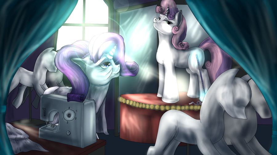
A older Rarity assisting Sweetie Bell get ready for the Grand Galloping Galla.
MLP:FiM/Rarity/Sweetie Bell (c) Hasbro
Art (c) 2013 Stephen "BlindCoyote" Scott
Sai and GIMP
**Note**: we still dont know what Sweetie Bell's cutiemark could be so didn't add it yet, once she gains it in the show I will update it accordingly
MLP:FiM/Rarity/Sweetie Bell (c) Hasbro
Art (c) 2013 Stephen "BlindCoyote" Scott
Sai and GIMP
**Note**: we still dont know what Sweetie Bell's cutiemark could be so didn't add it yet, once she gains it in the show I will update it accordingly
Image size
3000x1686px 3.64 MB
© 2013 - 2024 BlindCoyote
Comments11
Join the community to add your comment. Already a deviant? Log In
The anatomy is bad. Maybe not as bad as I tend to see sometimes, but still BAD. Things that hurt most are necks, front legs and Sweetie's entire trunk. It's too long, curves not where it should, her chest sticks out.
Hooves shouldn't be so round. This shape would be fine, if we were looking at pony from above.
The perspective is all off. I can't explain what exactly is wrong, because it'd be some hell of a writing. Perspective is HARD to deal with and requires practice, still life drawing, learning at least basics of descriptive geometry and even more practice. I'm still not perfect at it myself, to be honest.
What makes this piece somewhat attractive is, unfortunately, the shading. You don't seem to understand how do shades work. For example, if window is the only or main source of light, mirrors shouldn't reflect any of it, because they are turned back from the source. There are many more such mistakes... or perhaps you just messed the perspective up so much I can't even tell what is where. I recommend you to give up on shading and focus on perfecting the lineworks. I did that and it really payed off.
Second, the technique you use is just BAD. I see the burn/lightning tool. Don't use it.
And here we are, smudge tool. Just forget about its existence. Don't even touch it. It's the worst tool you can use for shading - it leaves these awful smudges and makes everything looks so... wobbly and dirty. So does the burn tool.
These were the most important mistakes I wanted to point out. Now a few minor things:
Half of the mannequin is missing (this one in the foreground).
I don't think Sweetie's hair work that way...
I'm really confused by Rarity's hair.
The magic effect is a bit confusing as well, it took me some time to actually notice it.
Lens flares are evil.
What I like about the picture.
The eyes. You managed to keep them simple but show the emotions.
Your choice of colors.
The sewing machine is nicely done.
I hope this critique will help you.